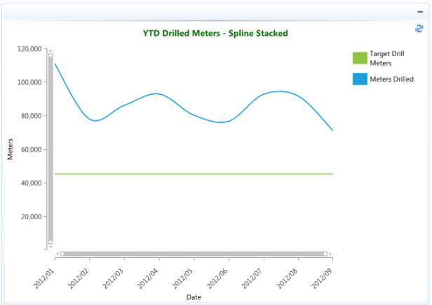
The Spline Stacked chart is a variation of the Spline chart. The areas are stacked so that each series adjoins but does not overlap the preceding series.
The Spline Stacked chart is often used for data modelling by taking a limited number of data points and interpolating or estimating the intervening values.
Use the Spline Stacked chart when you need visibility to the combined values for each category.
In the example below the actual meters drilled are compared to and stacked above the YTD monthly target drill meters.