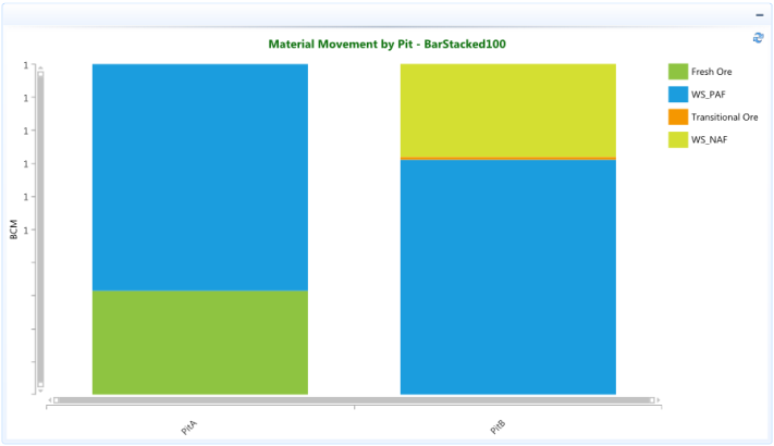
Bar Stacked 100 charts are used when you have three or more data series and want to compare distributions within categories, and at the same time display the differences between categories. Each vertical bar represents 100% of the amounts for that category.
In the example below the categories are various materials (Fresh Ore, WS_PAF, Transitional Ore, WS_NAF) that combine to make the total BCM moved from each Pit. The chart automatically displays a vertical bar stacked with a different color for each material to make them easier to distinguish. The different materials for each Pit are adjusted, so there combined value equals 100%.
Refer to the BarHorizontalStacked100 page for example of the data being represented as a stack of horizontal bars within a percentage of 100.