Bar stacked charts are used to compare contributions of values to a total across categories. Use the Stacked Bar chart when you need visibility to the combined values for each category.
Shows data in vertical bars as a stack of values in different colors, where each color represents a series.
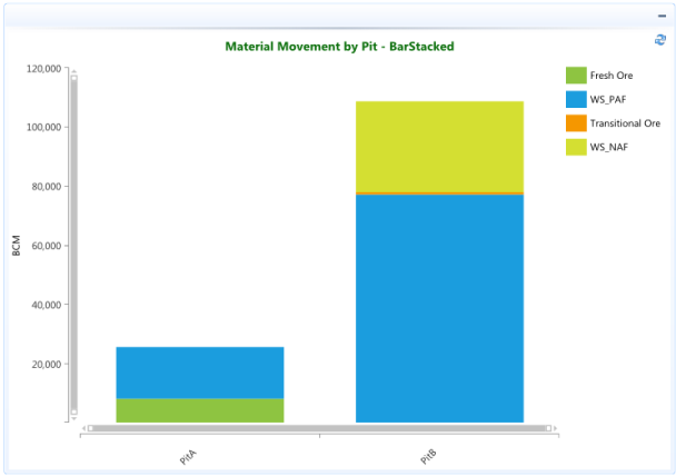
In the example below the categories are various materials (Fresh Ore, WS_PAF, Transitional Ore, WS_NAF) that combine to make the total BCM moved from each Pit. The chart automatically displays a vertical bar stacked with a different color for each material to make them easier to distinguish.
Refer to the BarHorizontalStacked page for example of the data being displayed as a stack of horizontal bars.