Area charts are much like line charts, but they display different colors in the areas below the lines. This colorful and visual display distinguishes the data more clearly. Unfortunately, data series with smaller values that are plotted in the back of an area chart may be completely or partially hidden behind data series with larger values that are plotted in front of them.
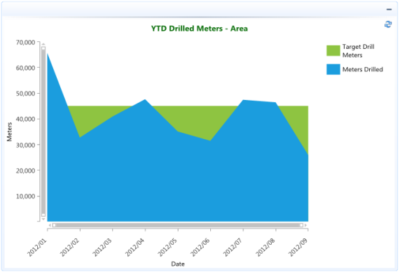
The Area chart consists of a series of data points joined by a line and where the area below the line is filled. Area charts are appropriate for visualizing data that fluctuates over a period of time and can be useful for emphasizing trends.
In the example below the actual meters drilled area is compared to the YTD monthly target drill meters area.