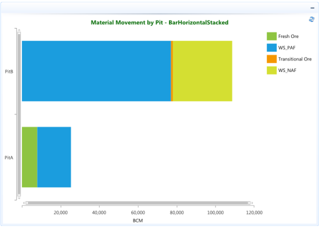
Shows data in horizontal bars as a stack of values in different colors, where each color represents a series.
Bar stacked charts are used to compare contributions of values to a total across categories. Use the Stacked Bar chart when you need visibility to the combined values for each category.
In the example below the categories are various materials (Fresh Ore, WS_PAF, Transitional Ore, WS_NAF) that combine to make the total BCM moved from each Pit. The chart automatically displays a horizontal bar stacked with a different color for each material to make them easier to distinguish.