There are a variety of bar charts that you can create, including vertical, horizontal, grouped, and stacked versions of each.
Bar charts graphically display values in vertical and horizontal bars across categories.
Bar charts are useful for comparing multiple series of data (i.e. providing snapshots of data at particular points in time).
Bar charts are good for side-by-side comparison and spotting trends in a small number of discrete data points. They're a good alternative to line charts when you have only a few data points in a series.
Bar charts graphically summarize and display categories of data and let the user easily compare amounts or values between different categories. Bar charts are useful for comparing multiple series of data (i.e. providing snapshots of data at particular points in time.
Shows vertical bars of lengths proportional to the magnitudes of what they represent.
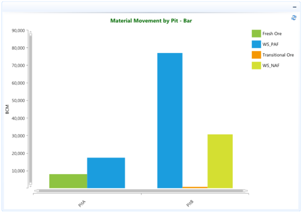
In the example below the categories are various materials (Fresh Ore, WS_PAF, Transitional Ore, WS_NAF) that combine to make the total BCM moved from each Pit. The chart automatically displays a vertical bar for each series in a different color to make them easier to distinguish.
This example shows a Vertical Bar charts. The series have a mechanism for combining data points that reside in different series, but have the same category.
Refer to the BarHorizontal page for example of the data being displayed in horizontal bars.